
ListView:
For you to create scrollable lists of widgets in your Flutter applications, the ListView widget is an essential building element. It effectively arranges the items in a vertical fashion, one after the other, making it possible for users to browse through a potentially enormous amount of data.
Types of ListViews:
Flutter offers various ListView constructors to cater to different use cases:
- ListView: Suitable for small lists where all items can be created upfront. It takes a list of Widgets as input.
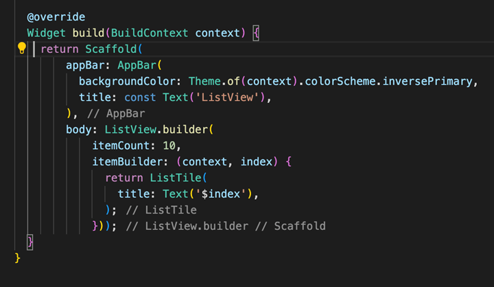
- ListView.builder: Ideal for large or infinite lists. It builds widgets on-demand as they become visible, improving performance and memory usage. Requires an IndexedWidgetBuilder function that constructs each list item.
- ListView.separated: Similar to ListView.builder but allows you to add separators between list items. It takes two IndexedWidgetBuilder functions: one for items and another for separators.
- ListView.custom: Provides the most flexibility for customization but requires a SliverChildDelegate to manage child model creation and sizing.
Example:
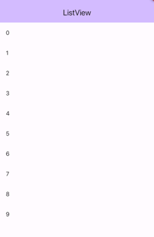
Output:
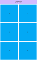
- GridView:
If you want to display items in a grid-like layout in Flutter, akin to a photo gallery or app icon layout, you should use the GridView widget. It presents information in a way that is both aesthetically pleasing and efficient with regard to space by arranging your content in a two-dimensional array of rows and columns.
Types of GridViews:
Flutter offers various GridView constructors to cater to different use cases:
- GridView: Suitable for small grids where all items can be created upfront. It takes a list of Widgets as input.
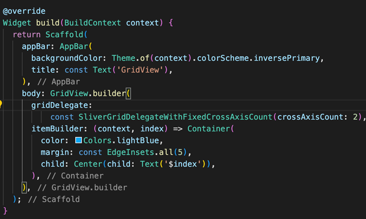
- GridView.builder: For huge or dynamic datasets, this is perfect. Like ListView.builder, it creates widgets as they are visible, and on-demand. Every grid item is constructed by the itemBuilder function.
- GridView.count: This is the simplest and most common constructor. It specifies the exact number of columns (crossAxisCount) in the grid
- GridView.extend: When you want items to have a maximum width (or height) but allow for some variation in their actual size, this constructor comes in handy. It makes sure that objects don’t go over the maxCrossAxisExtent value.
- GridView.custom: This provides the most flexibility for customization but requires a SliverChildDelegate to manage how child widgets are created and sized.
Example:
Output:
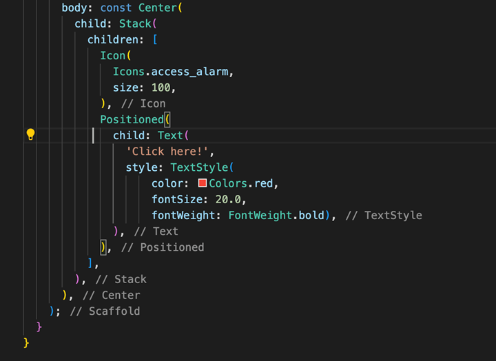
Stack
Widgets can be layered on top of one another to create complex layouts with elements positioned at various depths.It’s particularly useful for building UIs that involve:
- Overlapping elements: popups, floating menus, tooltips, or image carousels with captions.
- Complex positioning: You can precisely control the placement of child widgets within the Stack using various properties.
Key Concepts: - Stack as a Container: The Stack itself acts as a container that holds its child widgets. It sizes itself to fit the largest non-positioned child.
- Positioned vs. Non-Positioned Children:
- Positioned Children: These have at least one non-null property (such as top, left, right, or bottom) and are encapsulated in a Positioned widget. This lets you specify precisely where they are in the Stack.
- Non-Positioned Children: These are arranged according to the Stack’s alignment property, which in left-to-right environments defaults to top-left. Children in different positions can overlap
Properties and Customization:
- alignment: Controls the alignment of non-positioned children within the Stack.
- overflow: Defines how to handle content that overflows the Stack’s bounds (e.g., clip it or let it overflow).
- fit: Determines how the Stack sizes itself based on its child widgets (e.g., StackFit.expand to fill available space).
Example:
Output:

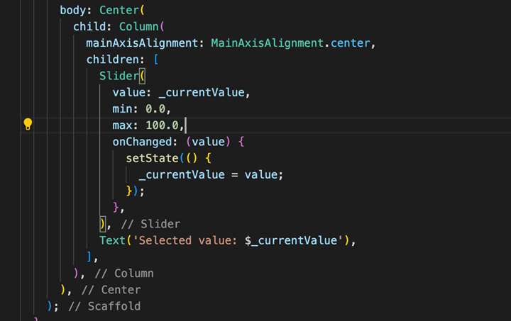
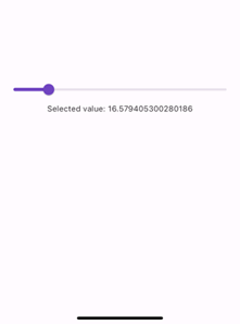
Slider :
A flexible tool for letting users choose a value from a continuous range in Flutter is the Slider widget. It works perfectly for settings, modifications, or any situation where users must select a particular value between a specified minimum and maximum.
- Key Features:
- Continuous Range: To choose any value within the designated range, users can slide their thumb along the track.
- Customization: You can control various aspects of the slider’s appearance, such as:
- Track color and thickness
- Thumb color and size
- Active and inactive track colors (indicating the selected range)
- Divisions (markers for discrete values within the range, optional)
- Labels (text displayed above or below the slider for specific values, optional)
- Value Reporting: When the user modifies the slider’s value, the Slider widget’s callback function (onChanged) is activated. Based on the chosen value, you can use this function to update other areas of the user interface or state of your application.
Example:
Output:
- Checkbox
A crucial component for developing user interfaces that let users select binary options (yes/no, on/off, true/false), is the checkbox widget. It’s a well-known and simple control for a range of scenarios, - Enabling/disabling features
- Selecting or deselecting items in a list
- Confirming preferences (e.g., “Remember me” option)
Key Features:
- State Representation: The Checkbox holds a boolean value (true or false) that reflects its checked or unchecked state.
Visual Feedback: It displays a square box that changes its appearance based on its value:
- Unchecked: Typically, an empty square.
- Checked: Typically, a filled-in square, often with a checkmark symbol.
Customizability: You can control aspects like:
- Value: Set the initial and subsequent checked state.On-Change Callback: Define a function that gets called whenever the user changes the checkbox’s state.Active Color: Control the color of the checkmark when checked.
- Check Color: Control the color of the checkmark itself.
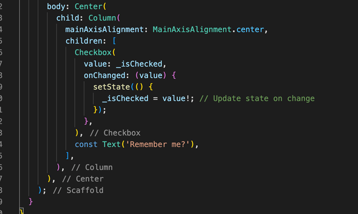
Example:
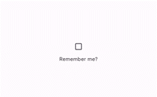
Output:
Radio:
To create radio buttons, which let users choose only one choice from a predetermined list of options that are mutually exclusive, the Radio widget is a necessary component. This well-known user interface element is perfect for situations where users must choose one choice from a range of options, such as:
- Selecting a preferred payment method.
- Choosing a size or color option.
- Answering a multiple-choice question with a single correct answer.
Key Features:
- Mutually Exclusive: To ensure that only one radio button can be selected at a time within the group, radio buttons are grouped together.
- State Representation: Each Radio widget holds a boolean value (true or false) indicating its selected state.
- Visual Feedback: Usually, it shows a circle outline that fills in when selected, giving a distinct visual cue
- Customizability: You can control aspects like:
- Value: Set the value associated with the radio button.
- Group Value: Specify the group to which the radio button belongs (ensures only one within the group is selected).
- On-Change Callback: Create a function that is called each time the user presses the radio button, enabling you to take actions or update the state.
- Active Color: Control the color of the filled circle when selected.
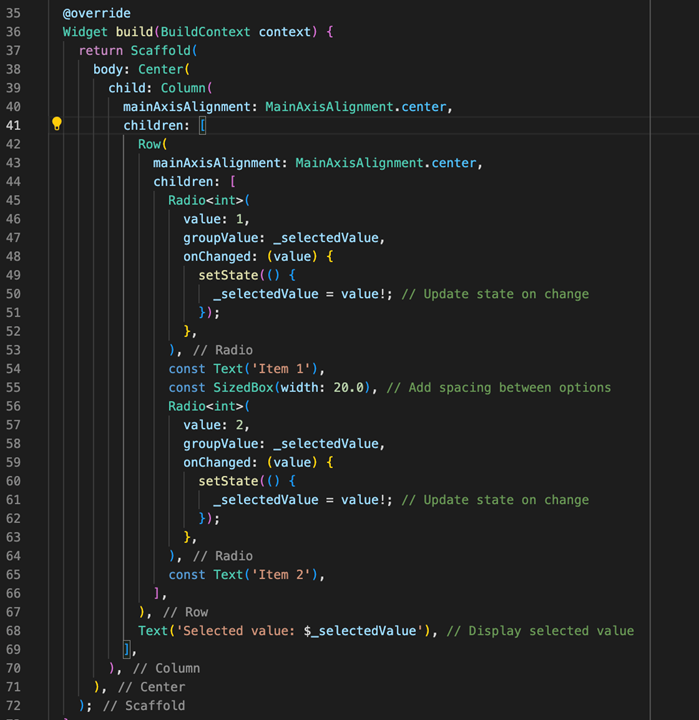
Example:
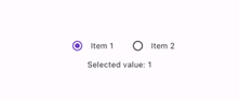
Output:
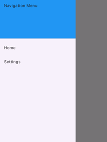
- Drawer
A key element in developing navigation menus that slide in horizontally from the screen’s edge is the Flutter Drawer widget. It’s a compact and Material Design-compliant method of granting access to different areas or features inside your application.
- Drawer
A key element in developing navigation menus that slide in horizontally from the screen’s edge is the Flutter Drawer widget. It’s a compact and Material Design-compliant method of granting access to different areas or features inside your application.
Key Features:
- Horizontal Sliding Menu: Usually activated by a menu icon in the app bar, the Drawer appears as a panel that slides in from the left or right edge of the screen
- Customizable Content: Any type of widget can be added to the drawer, giving you a lot of flexibility when it comes to displaying settings, options, navigation items, and even user data.
- Navigation Integration: To direct users to different screens or areas of your app based on their choices made within the drawer, the drawer is frequently used in conjunction with a navigator.
Two Drawer Implementations:
Flutter offers two main approaches to using the Drawer:
- Drawer with Scaffold: This is the most widely used and advised strategy. The main content of your app must be contained within a scaffold widget, and the drawer property must be set to a drawer widget that contains your navigation items.
- Manual Drawer Management (Less Common): This method entails making a distinct StatefulWidget just for the drawer and manually controlling its visibility state. It is less common, but for more complex use cases, it can be helpful.
Example:
Output:
- BottomNavigationBar
A useful method for adding a navigation bar to the bottom of the screen of your Flutter app is to use the BottomNavigationBar widget, a Material Design component. It’s perfect for letting users move between your application’s top-level views or sections with ease.
Key Characteristics:
- Placement: Resides at the bottom of the screen, providing easy accessibility.
- Items: consists of two to five elements, usually represented by icons with the opportunity to add text labels.
- Selection: Allows users to select a single item at a time, triggering navigation to the corresponding view.
- Accessibility: Ensure proper labels and semantics for users with disabilities.
- Number of Items: Usually, it is best to have three to five items for the easiest use.
Common Use Cases:
- Applications with several screens that need users to switch between the main sections.
- Tabbed interfaces where content is categorized and switching between categories is desired.
By consolidating BottomNavigationBar viably, you’ll improve the client involvement of your Flutter application by giving instinctive and quick route between top-level sees.
Integration with Scaffold:
The BottomNavigationBar is usually used with the Scaffold widget, which gives a basic structure for many Flutter layouts. We can use the BottomNavigationBar widget in the Scaffold bottomNavigationBar property.
Customization:
- Item Icons: Customize the icons in BottomNavigationBar by using the icon property for each BottomNavigationBarItem.
- Item Text Labels: Use the title feature to include extra words for better understanding.
- Selected Item Color: Change the color of the chosen item using the selectedItemColor setting.
- Unselected Item Color: Change the color of items that are not selected using the unselectedItemColor property.
- Type: Change the type of the Bottom Navigation Bar to “fixed” if there are less than four items, or “shifting” for a fancy animation effect when switching items.
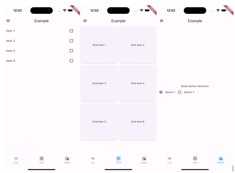
- Conclusion:
By using ListView, GridView, Stack, Slider, Checkbox, Radio, Drawer, BottomNavigationBar widgets we can create simple screens like :
As one of the best IT staff augmentation companies, Nuventure’s dedication is to promoting creative and efficient mobile app development by utilizing the most recent technological developments. Hire the remote mobile developers through our portal, book a call for further enquiries