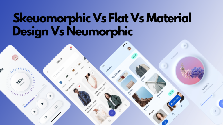
Ever since the beginning of mobile user interface, design styles have evolved. Improvements in technology, changes in users’ level of understanding, and of course the need to improve things drove new design trends. When mobile devices were first introduced, the UI was based on skeuomorphic principles, which later gave way to flat and material designs, and now, neuomorphism appears to be leading the way. What do all these design principles mean? What are the characteristics of these UI design movements? Let’s have a look.
Skeuomorphism and Skeuomorphic UIs
When the smartphones and touchscreen devices first arrived, or even before that, on computer screens, user interfaces followed skeuomorphism. The idea is to use elements that closely resemble physical or real-world objects. Even though we’ve moved past this design style, you can still see skeuomorphic elements in present-day UIs. The recycle bin still looks like an actual recycle bin, e-mail icons still look like a mail or a postcard, most phone apps have an icon like that of an old telephone.
When personal computers were becoming commonplace and smartphones were just trying to make their place, designers wanted to make interfaces that intuitively told the users what they did. For example, if something looked like a button, users knew they could push it. And that’s how skeuomorphism became one of the earliest trends for UI design.
Because of this need to resemble the real thing as closely as possible, there was a lot of emphasis on giving a 3D appearance to the elements. Remember the early smartphones and their glossy icons and buttons? The shutter button for the camera used to look like a physical red button with a glossy appearance, the sliders for adjusting the volume or seeking a video looked three dimensional.
There was a lot of importance given to shadows, gradients, and anything that could bring them as close as possible to the real thing. Apple was one of the main proponents of skeuomorphic design, and this probably played a huge role in the success of the first iPhone. It was one of the first few to not have a user manual. The design ensured that users could intuitively know what the elements did.
Flat UI design
The problem with skeuomorphism was that it made the interface look cluttered, it wasn’t clean. This gave rise to flat UI design in mobile interfaces. The flat design took all the 3D out of skeuomorphism.
Elements of skeuomorphism remained, camera apps had icons that looked like a traditional camera, email apps had icons that looked like a letter. But the elements were more simple. The buttons lost most of their 3D aspects, gradients and shadows were minimised. As people got used to digital interfaces, there was no longer a need for the interface to look like physical objects. Elements were simple and the interface was minimalistic.
Microsoft was one of the first proponents of flat design. Windows Phone and Windows 8 heavily featured designs with flat tiles and icons. One of the main criticisms of flat design is that it didn’t give a lot of cues to the user.
Material Design
From flat design came Material Design from Google. Material Design can be considered as somewhere in between flat and skeuomorphic, but closer to flat. The elements were flat in the sense that there weren’t a lot of gradients, and the icons were clean.
But there were some 3D aspects to the design. Google wanted the interface to look like paper, as in how paper creates shadows, reflects light, but itself was more or less two dimensional. All the elements were two dimensional, but when they come on top of each other, they create shadows and depth.
The idea was to keep the simple and minimal feel of flat design, but make it more intuitive and user friendly.
Neuomorphism in UI design
Neuomorphism or new skeuomorphism brings back 3D to UI design. It takes the “flash” out of skeuomorphism and goes instead for a soft look and feel. As we discussed, in Material Design, the cards were like paper, the elements were above the surface. In neuomorphism, the cards appear to be pushed up or extruded from the surface, and therefore there isn’t a lot of contrast between the two.
This can create an accessibility problem without other cues. And indeed this is one of the main criticisms of neuomorphism.
Neumorphism first shot to popularity after a Dribble shot by Alexander Plyuto. Its popularity rose through a medium article that described the new design language. You can try this new design trend using this CSS generator.
It’s not yet clear if designers and startups will adopt neuomorphism, it’s still a new trend. But if the dribble shots are an indication, it looks like neuomorphism is on its way to popularity.
Looking for an amazing UI/UX for your project? Reach out to us for a consultation
Images used: Skeuomorphic, Flat Design, Material Design, Neuomorphic